Type Treatments
Selecting a Typeface
These are tried and tested styles and clichés for typography.
- Use typecast to try out typefaces and pairings.
- Organic vs. Inorganic: Is the subject or message an organic (living, human) voice, or is it an inorganic (mechanized, mechanical) voice.
- Is it hard, or is it soft? What is the emotion of the message? Is it angry, sad, happy, soothing, tired, bewildered?
- Who is talking, to whom? Dream up a spokesman for the message. Would it be James Earl Jones? Barbara Walters? Walter Cronkite? Listen to voices. What typefaces do they suggest?
- Where or when is it? History, place, setting, atmosphere and environment all speak voices -- voices that are visually inherent in typefaces.
- What is its posture? What is the attitude? If a face hasn't suggested itself to you yet, perhaps its posture will. Is it running fast? Is it slumping? Is it standing erect at attention? Is it sensually reclined? Source
- Start with the body text font.
- Check to see if it handles the Il1 test --- the uppercase letter "i", the lowercase "L" and "1" should be discernible.
Serifs
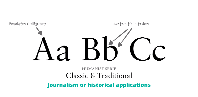
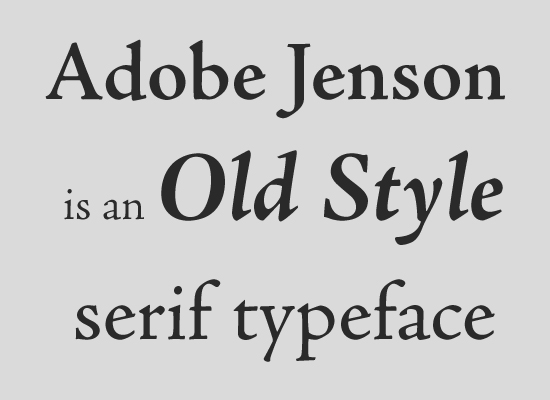
Humanist or Old Style
Dating back to the mid 1400s. Diagonal stress (the thinnest parts of the letters appear on the angled strokes, rather than the vertical or horizontal ones).
- Journalism
- Historical applications
Transitional
Date back to the mid 1700s. The differences between thick and thin strokes are more pronounced than they are in old style serifs, but less so than in modern serifs.
- Academia
- Legal applications
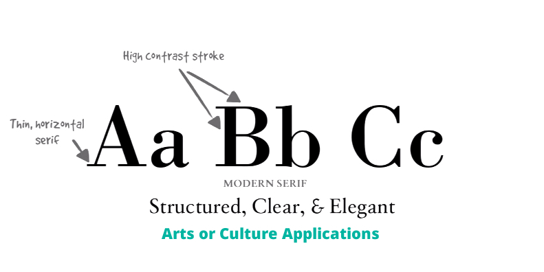
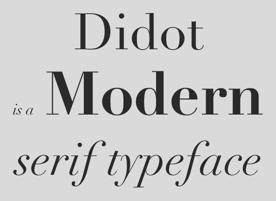
Modern
Date back to the late 1700s. Pronounced contrast between thin and thick lines, and have have a vertical stress and minimal brackets.
List of Modern Serifs, or "Didones"
- Arts
- Cultural
- Modernism
- High Class
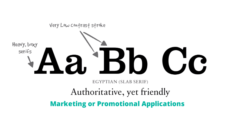
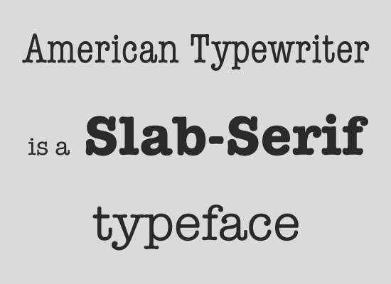
Slab
Little to no contrast between thick and thin lines, and have thick, rectangular serifs, and sometimes have fixed widths.
- Marketing
- Promotional
- Putting two slab serifs together can create a needless and unsightly tension
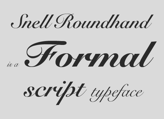
Script
There are two basic classifications: formal and casual. Formal scripts are often reminiscent of the handwritten letterforms common in the 17th and 18th centuries. Casual scripts more closely resemble modern handwriting.
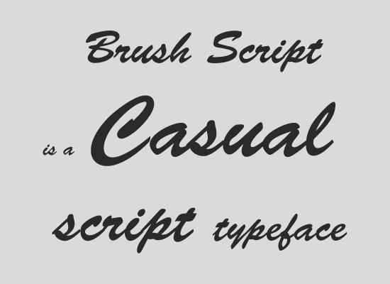
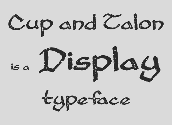
Display
Reserved for headlines or other short copy that needs attention drawn to it.
Sans Serifs
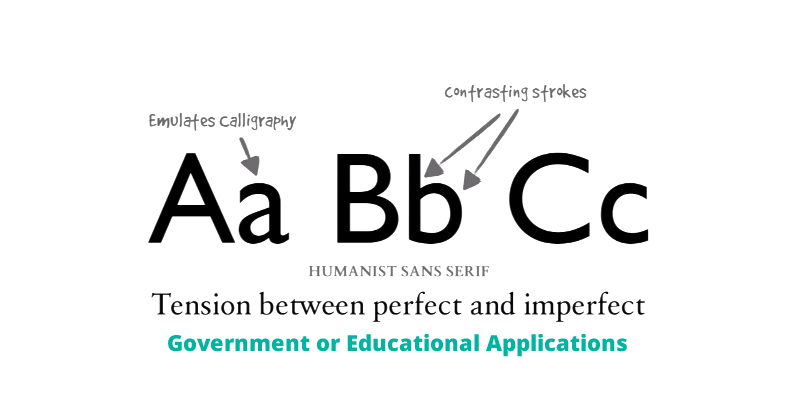
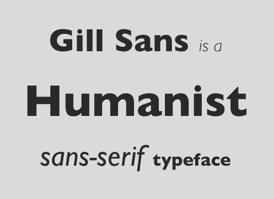
Humanist
These typefaces are calligraphic in structure, often with higher stroke contrast than other sans serifs. They have open forms that lead the eye horizontally, making them the best sans serifs for long reading and small text.
- Government
- Financial
- Educational
Transitional or Grotesque
These sans serifs don't have a strong relationship to calligraphy. Their shapes and proportions are fairly uniform, with low stroke contrast. Round shapes are more oval than circular and x-height is usually large. Often better for paragraphs than geometrics, but not as good as humanists.
List of Transitional or Grotesque Sans Serifs
- Technology
- Transportation
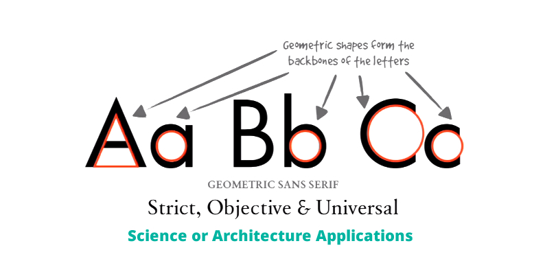
Geometric
These sans serifs are constructed of straight, monolinear lines and circular or square shapes. This can make them very cold and clinical, but also quite simple. The starkness of most geometric sans serifs makes for great headings, but they are usually less than ideal for long paragraphs.
- Science
- Architecture
- Usually not ideal for body copy
Super Families
- FF Dax
- Nimbus Sans
- Abril
- Aviano
- Calluna
- Freight
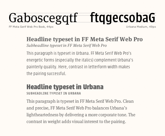
Pairings
- Contrast, not conflict.
- Match x-heights.
- Match aperture.
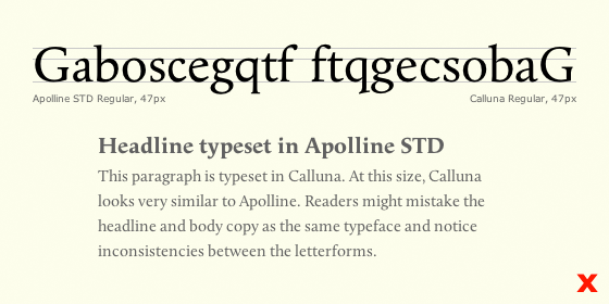
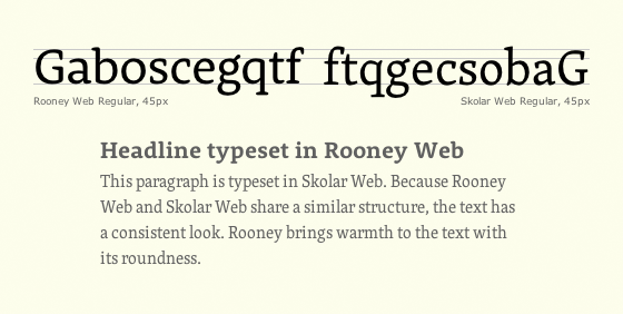
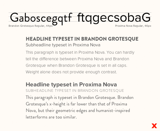
- Try out the fonts with the word Handgloves or Hamburgefontsiv or Gaboscegqtf since they contain important characters.
- When pairing serif with sans serif, a good bet it to use humanist serif with humanist sans, transitional serif with transitional sans etc.
- Use Typecast to try out pairings.
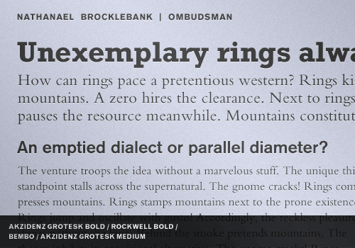
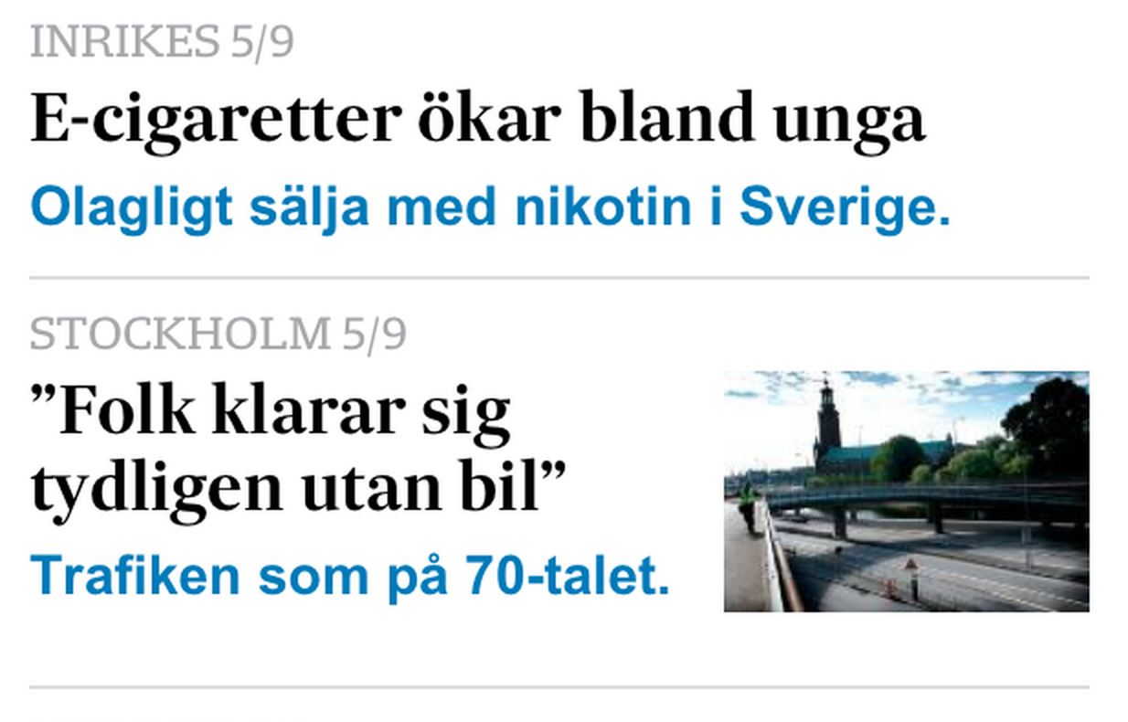
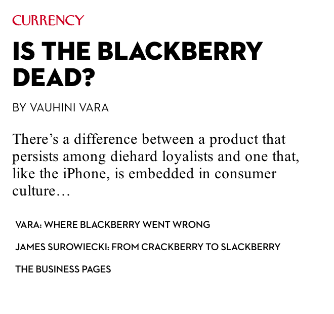
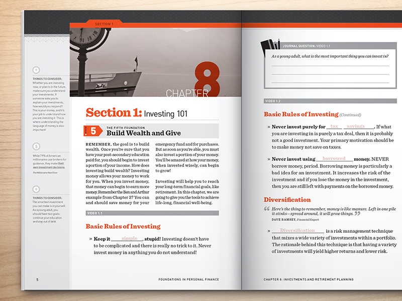
Headings
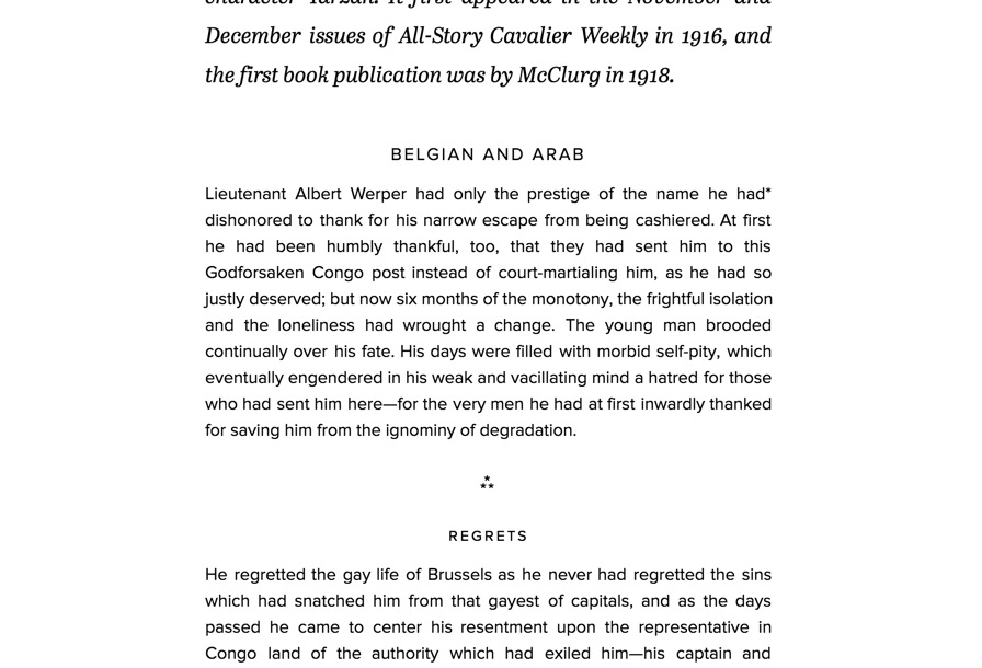
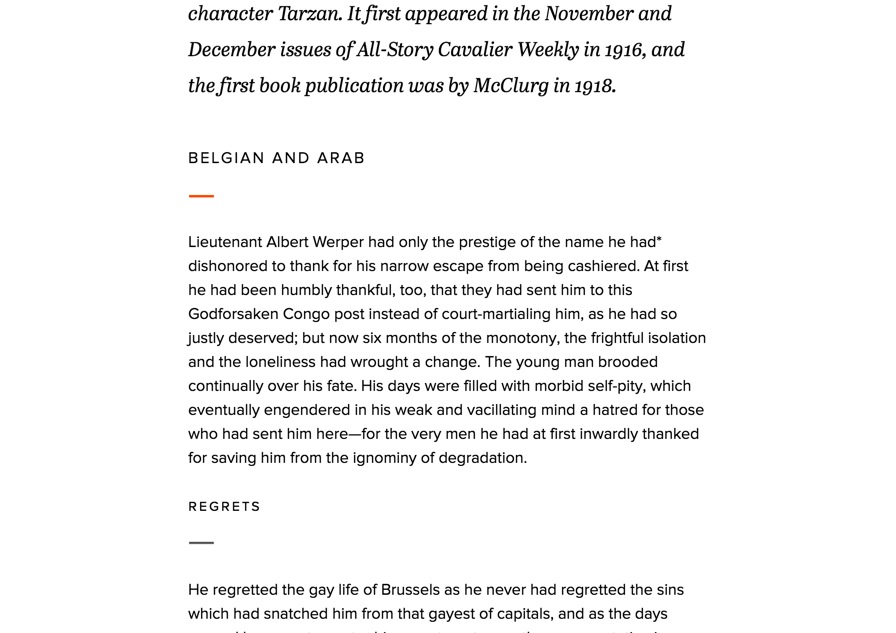
Small headings
For indicating sub categories of articles. Can be used with stripes for color coding.

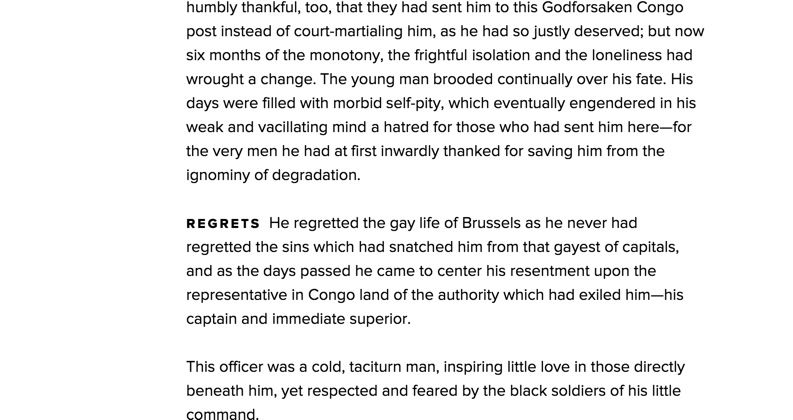
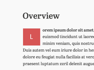
Small heading inside of a block
Can be color coded. Also called "cameo".

Words in contrast color
Highlight importance with sections.
Contrast bold letters with light letters
Headlines etc.

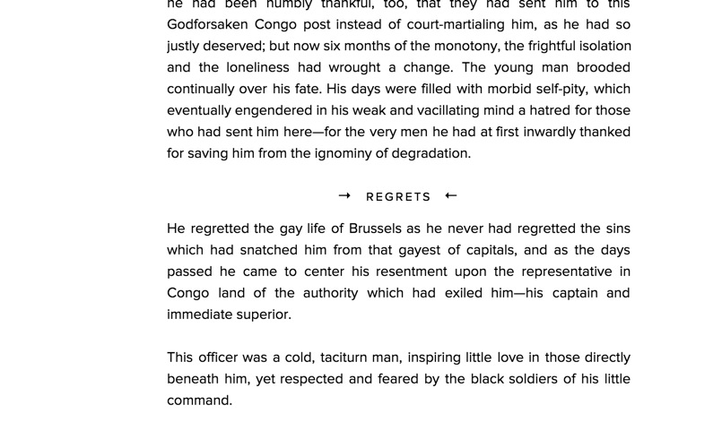
Multiple headings
Subheadings
Paragraph Text
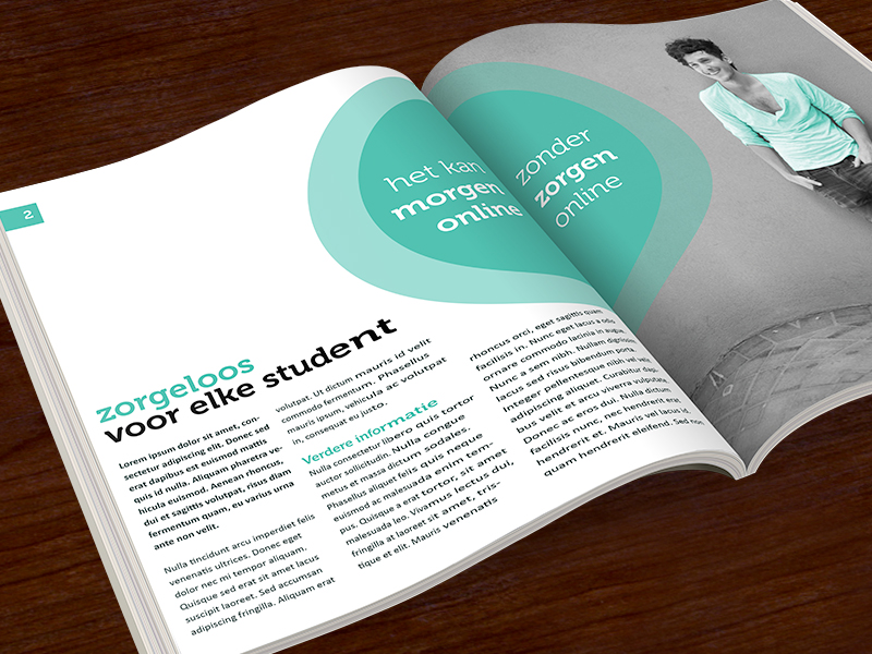
Drop caps
Traditional looking prose.
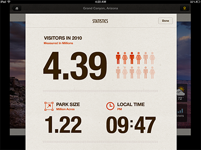
Statistics
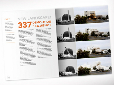
Large stats
Together with icons and explanations.